Ethan is an architecture student, graphic designer and founder of design architecture studio ‘Magni Studio’ with a great passion for how people interact and experience both each other and the ever-changing social and urban environment.
The Graphic Design of No Art Speak
By Ethan Scotney
I wanted to write this, the first of many little blog posts, to talk a bit about the overall design of No Art Speak. Whilst not trained in graphic design, I chose architecture instead and immersed myself in the world of graphic design to better my projects with the help of my friends, who are actual graphic designers. Shout out to Eden for inspiring me throughout our time studying together at UoN. I’ve picked up a lot of knowledge and skills in both print and web/digital design, slowly finding my voice in graphics and adapting to the task.
The design language for N.A.S. is quite simple, no ‘art speak’ required. The overall design language echoes our messaging; we’re not going to dumb things down, but we won’t overcomplicate either. Treating readers as the thoughtful people they are and spreading the art of photography and the powerful cultural messages it can convey.
I’ll start with the biggest hurdle of this design learning experience: the logo. I wanted something clean, simple, but different from the typographic logos I see now. I’ve always enjoyed the clean lines and creativity of graffiti tags, which speak to the magazine’s street photography roots without pushing it too far in that direction. A more refined oval was both a fun and cleaner choice after a few attempts at writing something digitally myself. Then came the tricky part: setting up guides and experimenting with slight adjustments, overlapping the ovals to generate rough lettering in Affinity Designer (no Adobe here!).
The choice of green is something I stumbled upon in a paper texture I was using for a different project, the energetic nature of the green, the ideas of new and fresh aligned with what we want to deliver through N.A.S (#15A54E & CMYK 82, 7, 98, 0 btw.) An absolute favourite of both Paul and myself, I hope will as time passes, be associated with No Art Speak.

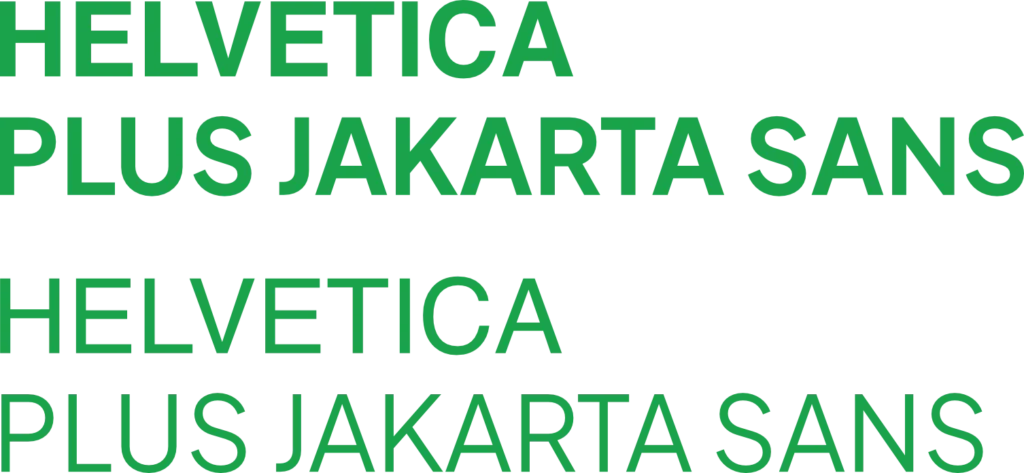
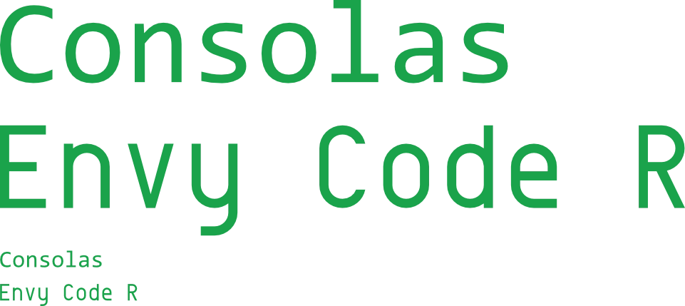
For the fonts used, I wanted to keep it muted but have some difference and handmade-ness. As a bit of a computer nerd, I’ve always been a fan of monospaced fonts such as Consolas, for their slightly futuristic nature and their easy readability at smaller sizes, both on screen and in print. Consolas, however, wasn’t used in the making of the website as it’s a Microsoft-owned font and not to be used for other commercial purposes like N.A.S. Instead, after much searching, I found an open font called ‘Envy Code R’ For headings. However, I also chose the open font, ‘Plus Jakarta Sans’. It’s slightly slimmer and livelier than Helvetica, and on a more personal level, Plus Jakarta Sans reminds me of my partner Raina, who is from Jakarta.
There’s more design to explore, especially as we delve into the design language and development of our first issue, ‘The City Weeps’, so stay tuned for that. I’m really excited to tell you all about it.
Thanks for reading this first N.A.S. Extras as well! I hope you enjoyed reading. If you have any feedback or would like to contribute to later N.A.S. Extras or issues, please use the link.
We look forward to hearing from you.
I hope you all have a good day, afternoon or night.
Until next time
Ethan Scotney.